

SOS Estudante
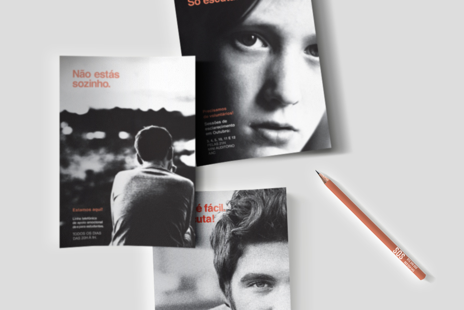
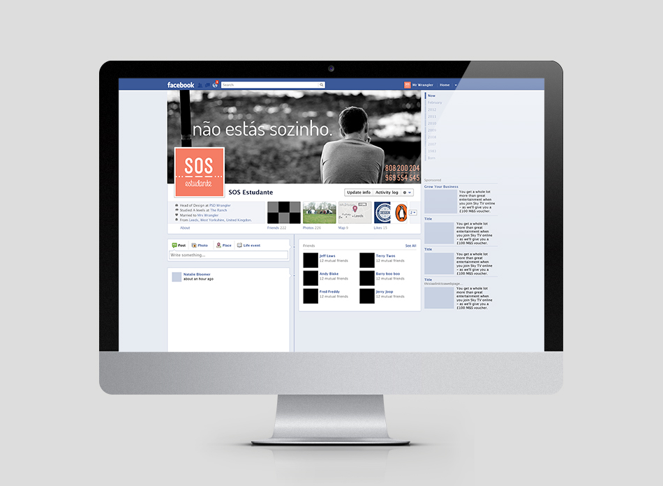
Visual identity system for SOS Estudante, a helpline for students focusing mainly on suicide prevention and support for students with emotional problems.
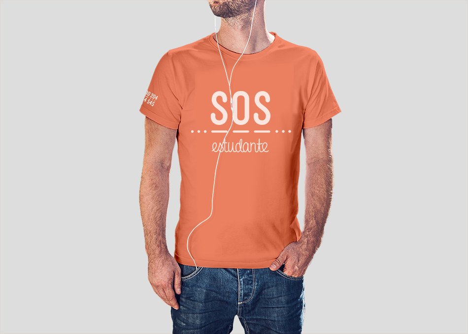
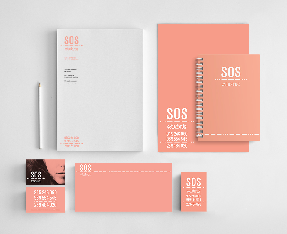
The logo created for SOS Student consists of a symbol and the name of the helpline.
The acronym SOS has a bold appearance in order to emphasise the main objective of the line: immediate help.
The second part of the logo is set in a font simulating handwriting, in a a reference to the target group: students.
The element used between the two words symbolises the phone line and is the Morse code for SOS. The use of Morse code is a reference to the anonymity the service provides for its users.
This was a pro-bono project.
