Nova Delphi
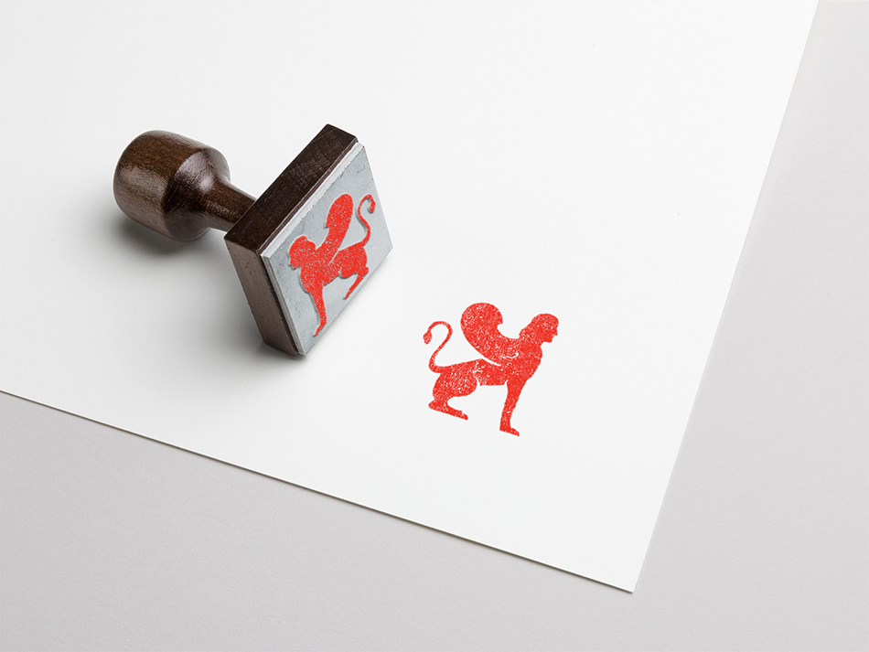
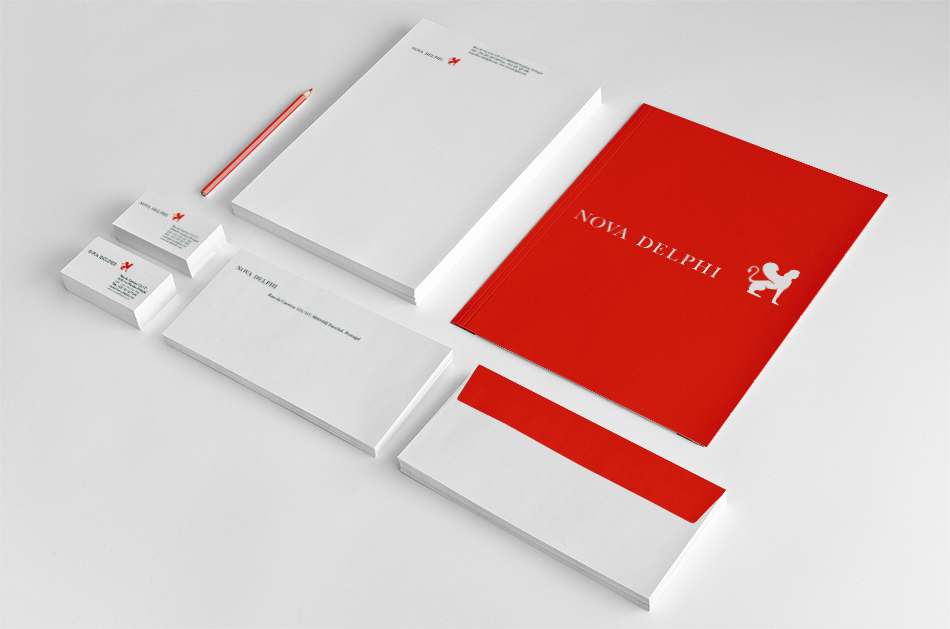
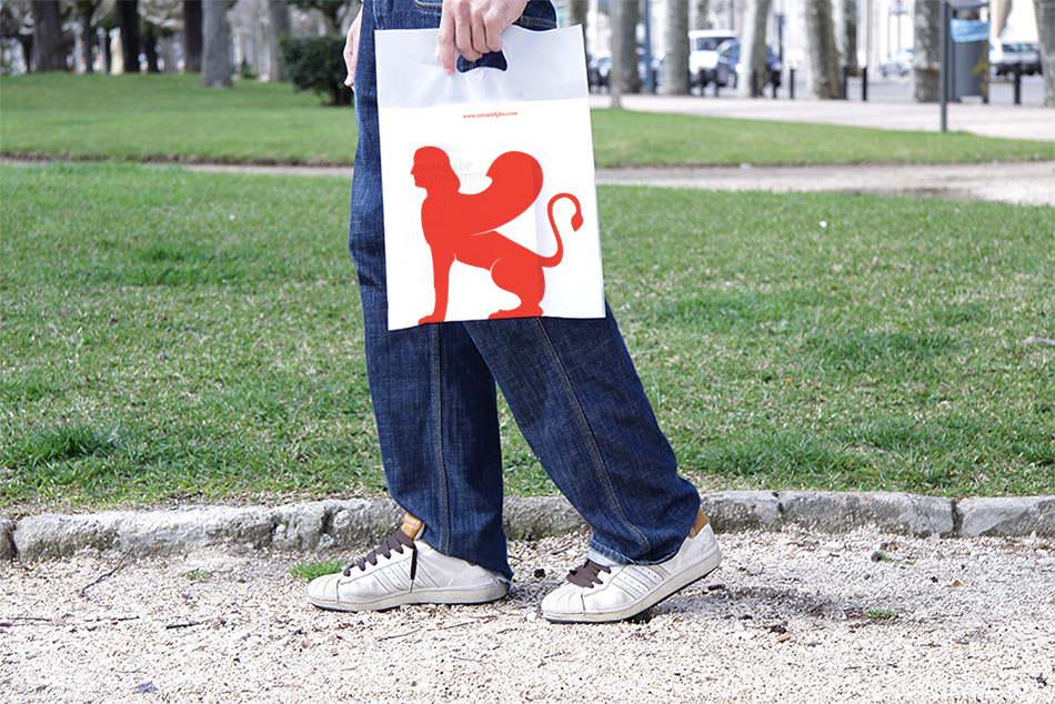
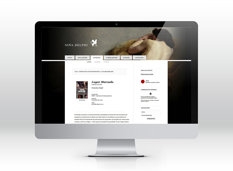
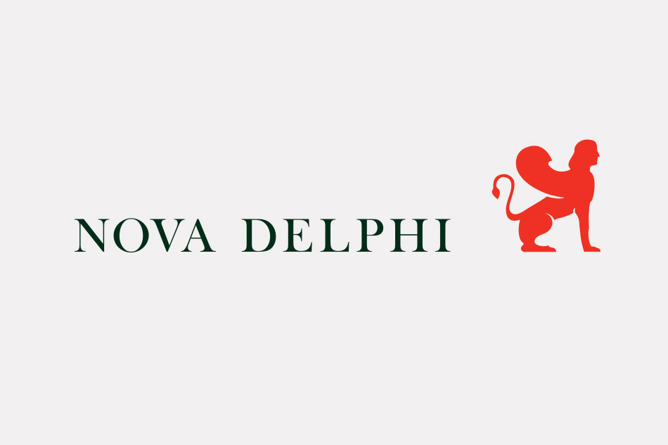
The origin of the name adopted by this publishing house was taken into account, having served as reference and inheritance in the search for the symbol that would give substance to this story. The design of the symbol - the Delphi Sphinx - began after we looked at one of the sculptures found in Delphi, the Greek archaeological site, home to the most important oracle of the Ancient World.
The symbolism of this mythical monster - a woman's face with a lion's body and wings of a bird of prey - and the meanings that it carries are strong, and seemed appropriate for the creation of this visual identity.
All things associated to the Sphinx - the challenge, the quest to solve something, the enigma, the puzzle - are fertile grounds for the imagination, and translate well towards the publishing philosophy the client wanted to adopt: open for discussion and reinterpretation .
The design of the animal was based on a picture of the above mentioned sculpture, being refined during successive iterations.
This process aimed to move away from the image of the object of departure, but also to obtain a clear mark with detail which can be easily reproduced with the best possible readability.


